Monday, November 29, 2010

Design is Dangerous!

Photobucket


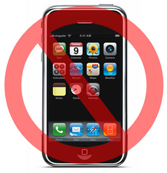
A few years ago, my dad told me that excessive cell phone use was not good for you. Not because I may not pay attention to him while I text, or because I spend more time on my phone than doing something that is actually productive. Studies have shown that cell phones are not the only devices that are dangerous. Cordless phones, wireless routers and laptops are also culprits of endangering their users.

How is it dangerous?
Most people in today's society use cell phones at least once a day. That exposure alone, makes a difference in increasing the possibility of being diagnosed with cancer. According to research done about cell phone usage and its connection to cancer, invisible energy rays that connect cell phone to cell towers can damage the body's immune system, as well as alter our cellular make-up.

What makes it dangerous?
It is because the wireless waves can damage body tissue. One problem that has been caused by regular cell phone usage is cancer. If that is not dangerous, I am unsure what would be considered dangerous. Because there is very little knowledge available about the dangers we face by simply sending a few emails on the computer sitting on our lap, or using the cordless phone in our homes to speak to a relative, we are unable to defend ourselves from the heightened risk of cancer diagnoses.

Was the danger an intentional or unintentional consequence?
I feel like the danger was unintentional. Unfortunately, just because the danger may not have be intentional does not mean that there will be no serious consequences. In fact, although studies have shown the direct correlation of cancer and cell phone (and other wireless device) usage, the Federal Communications Commission (FCC) still considers intensities that can cause these issue safe.

Women's Health recently published an article about this very topic. They also gave suggestions that could helps avoid the high risks. Some included turning off wireless routers when they are not in use, keeping your cell phone as far away from your body as possible, and if you still use a phone in your home, it is better to install a phone with a cord. But because, much of the U.S. population is very dependent on their handy cellular devices, I would not image that just telling people about the dangers would change people's attitudes and behaviors to lower their risks.

I also do not know how possible it would be to lower the intensity of radiation waves. There needs to be a change though, or the percentage of people diagnosed with cancer due to cell phone usage will continue to increase. We need to design better for the future.


Design in Society: The Canteen

Plastic and aluminum and glass... OH MY!! The United States is indeed a consumer society. This is something that gets reconfirmed in my mind when I think about the crazy incidents that ofetn take place on "Black Friday" and when I think about how many plastic bottles I've used in the last three years as an undergraduate student. Landfills continue to be filled with these material when they should be recycled, if not eliminated from use all together.

With the wide spread knowledge about climate change, it's interesting to know that many folks continue to pollute the earth by making the conscious decision to use products that are hard to get rid of once they are done being used. Often times, waste used by the US is sent to third word countries who also do not know how to make the best of the situation. One design that dates back to the times of World War II, but will function as a tool to use less plastic, aluminum and glass, as well as slow down climate change, is the canteen.

Photobucket

The canteen is a container that will help people in today's society because they will only need one of these containers for their entire lives, unless something drastic happens in which the canteen is lost or damaged.

I am unsure if this was the original idea for the canteen but I am happy that it is able to serve this purpose. The canteen is a great design because it is an easy way for people to alter the state of the environment in a major way.

Photobucket


Now, they are even made more aesthetically beautiful as you can see in the above photo. Simple designs like the canteen can definitely improve society as we know it. Buy a canteen! It's good for you!

Color Transforms: Sports Car Edition.

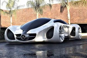
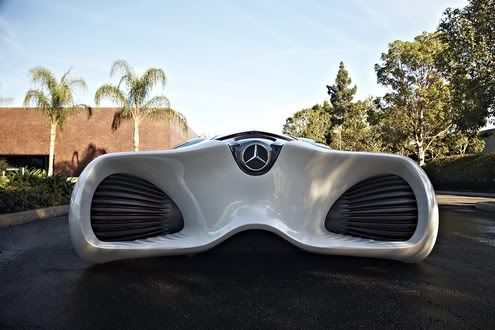
When I think about Mercedes Benz, I do not think eco-friendly. I think luxury, fast, beauty. Fortunately, they are changing the way they do things for the future. The Mercedes Biome is said to be created with organic materials and to only emit oxygen when on the road. That sounds like a good combination to me: luxury + eco-friendly.

Photobucket

Photobucket


Photobucket

Take a close look at the Mercedes-Benz Biome.

What are the colors you see? White, black, and a hint of silver, correct? These colors make the car look very modern, if not futuristic. Can you image this car in any of the CMYK colors? I cannot and I think it is because with the design of the Biome comes simplicity. Adding color would only take away from that.

When thinking about depictions of the future, can you recall ever seeing bright colors? Some ideas I recall are simple and dark. There are no loud or cool colors.

Any thoughts about this design and the interaction of color?

Monday, November 15, 2010

Word & Image Continue to Work.

Will.i.am feat. Nicki Minaj–Check It Out


Watch the video so that you will better understand everything I will be discussing.

Since Professor Housefield showed this video in class, I have been slightly obsessed with it. I even have my roommates singing the song. I am actually a bit mad at myself for being so impressed by this song and video because I pride myself in being a fan of music with substance. This is close to the opposite of that very thing.

The only thing that is keeping me away from being so critical of the language and the message of the song is the fact that the video seems so planned out, as far as design goes.

During my groups discussion, we talked about why Will.i.am and Nicki Minaj may have wanted to use another language in their video. Because their major audience is in the United States, it may seem a bit unnecessary because it is assumed that most people speak English. But then again, the US is a country that has many citizens and people that are undocumented from different cultures and speak many different languages. One reason may have been to reach a larger audience that may enjoy the beat of the song but may not be able to relate because the lyrics are in English. As viewers that could not understand the script for ourselves imagined that the words that showed up on the screen were directly translated from what they were saying out loud. The script that is seen in the video is Korean. A lot of the popular music in Korea now is similar. Take the group 2NE1 for example:


Is the video not just a little similar to that of Will.i.am and Ms. Minaj? It makes sense, to me, to make Korea a target audience. The creators of this video, like the creators of many products which are designed, had an audience in mind and fit the creation of it to please them.

Something else that I found interesting in the "Check It Out" video is how word and image worked together. The colors of the Korean script and their clothing matched. There was a sense of aesthetics that came with this. The colors in the video made it more appealing to the viewers' eyes. It also helped that Nicki Minaj was very animated in her pepto-bismol pink jumpsuit.

Once again, word and image come together and work for man and womyn-kind. Where are some other places you see word and image working together?

Sunday, November 14, 2010

Design Criticism: The Swivel Chair Ergonomics Edition

When thinking about the ergonomic design of a product, I am reminded of when we watched ‘Objectified’ in class. The creators and designers featured in the documentary discussed how the products that they help manufacture are thought about. They talk about how there are many steps in the creative and design process before the products are actually sent to warehouses and stores, then sold. They never said it explicitly, but I am sure they all think about the safety, comfort, ease of use, performance and aesthetics of their products. In short, seeking a sense ergonomics is apart of their process.

One piece of furniture I am interested in knowing more about, as far as ergonomics goes, is the swivel chair.

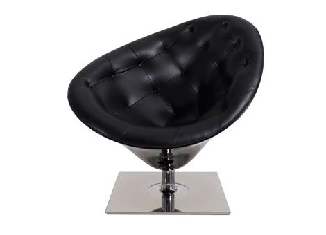
Photobucket


I fell in love with one when one of my best friends decided to place one in her bedroom. It was in a sense, my chair. And I did not think about it at the time of sitting in it, but it successfully possesses all of the facets that make up ergonomics.

Safety. The shape of the chair is very accident proof. Many teacher and parents do not like when their students and children lean back in their chairs because there is possibility to fall back and break something. Swivel chairs, and in particularly the one pictured above, almost eliminate the potential of falling backward.

Comfort. Because the chair resembles a hand cupping something, it kind of gives that same affect to the person sitting in it. The comfort of the swivel chair ties into its safety. By feeling safe sitting in the chair, the users of the chair will have a greater chance of also feeling comfortable.

Ease of Use. If a chair is not one of the easiest objects to use, I do not know what is. All a person has to do is sit in it. That is, if they are an able-bodied individual. For a person that has to think about how they are going to do almost everything that most of us take for granted, such as sitting in a chair, this task may not be so easy. How is it that we forget to make things accessible to people of all abilities? In this faect, the swivel chair only reaches its highest capabilities for people that are able-bodied.

Performance (productivity). This is a tough thing to analyze for a chair. People sit in it. Can we really call that productivity? I think so. When people sit they are usually doing something else as well. Eating, watching television, working on a paper are just a few examples. The swivel chair does not allow productivity by itself, but it does work with other objects to produce. After all, what is a desk without a chair to sit in front of it with? The swivel chair serves its purpose and serves it well.

Aesthetics. This word can be defined as visually pleasing; objects that have aesthetics in mind tend to raise the question of beauty. Beauty is subjective. My best friend may not see what would be seen as beautiful to me as beautiful. In the case of the swivel chair, to me, the beauty is undeniable. The simplicity of it is what makes it beautiful.

The swivel chair achieves the ergonomics by my standards. But is the whole idea of ergonomic design really subjective?

Monday, November 8, 2010

How Word & Image Work Together: Advertisement Edition

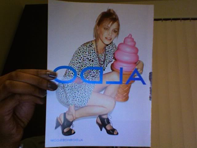
Take this picture. Look at it as though, there were no words on the page? Would you know what the ad was about? It could be trying to sell a dress, a pair of shoes, maybe even that giant ice cream cone.

Photobucket

Or this one? Is it advertising hand accessories or mascara? It could even be trying to sell hair products?

Photobucket

If so, the visionaries for this photo advertisement did a great job. This, however, does not always happen.

And what if, you took the picture away, but kept the words? In the first ad, it would give an idea of what the company sales because the website is aldoshoes.com. But then, one could wonder What kind of shoes are being sold?

Like comics, advertisements would not be the same without BOTH image and word. In a sense, they complete each other. What you do not understand from just the picture can be further explained by the words, and vice versa.

Who is That Building Made For?

All design starts with form and content. There is a vision that the designers want to get across. Then they choose a medium to which they want to get that message across.

In designing buildings, I am wondering if the architects think about the people that will live inside of them.

I very recently wrote a post on my personal blog about living in a New York City Brownstone.

Photobucket

Now I am wondering if I fit into the audience that the designer of the very famous brownstone was created for. Was there even really an audience?

Sunday, November 7, 2010

How Word & Image Work Together: Brian Fies Edition

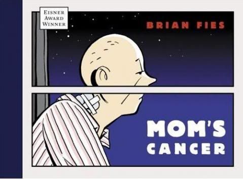
Last Thursday, the graphic novelist Brian Fies, was a guest speaker in "Introduction to Design". He is the man behind the books Mom's Cancer and Whatever Happened to the World of Tomorrow? He discussed why he chose to use comics as his medium of communication. The main reason is because he had been interested in comics for a long time and it just impressed him.

Photobucket

He compared comics with rock music. The words of rock music would not function as well as they do without the music behind them. It was a great comparison because comics work the same way. The images in comics are further explained to the audience by the words in bubbles or in boxes, which often give background information. In this combination, the words and pictures add up to more than the sum of their parts. In other words, there are dependent upon one another.

Fies' book entitled Mom's Cancer is based on the real life situation of his family dealing with the effects of exactly what the title suggests. Because the topic is very heavy, he had to come up with clever ways to get his points across to his readers. He was very successful in his attempts.

Word and image complemented each other in the book. This can be related to Gestalt theory because, the audience has to look at the entire piece in order to fully understand it. Every part matters.

Fies also uses symbolism and metaphors to get his point across. His words were that, he "plays with the line of ridiculous and dead serious." One example of this is the page in the book where he illustrates his mom walking a tightrope in which he is trying to show his readers that "balancing medication is like walking a tightrope" (this line is also clearly written on the page). Again, comics transcend words and drawings; neither has meaning without the other. How would readers know that this was the point unless it was otherwise stated?

Monday, November 1, 2010

nail art

Nail art is a concept that is on the rise. As I browse tumblr for inspiration for things to blog about, there is an abundance of nail art on my browser.

Do we ever take into account how long it takes for a manicurist, or nail designer, to perfect their craft? I do not think I ever do but I feel like it is something to be noticed.

[to be edited]

Let me see that backback!

The backpack seems very simple, but is it really? Jansport and Northface are the brands I see on the backs of students as we walk to class, the co-ho and any other destination that we may have.

I don't think we think much about the concept of the backpack. It is brilliant really. Whoever came up with the concept is amazing for doing such a great thing. I think the fact that so many people over look the brilliance of the backpack shows that it is a great design. It is an object that is hard to improve.

In Objectified, designers talked about the main qualities of a great design to include simplicity and ease of use. The backpack clearly has these qualities.

Objectified: Form & Content

The film, Objectified, was nothing short of amazing. There were many designers that shared their wisdom and opinions on the design of everyday objects.

Henry Ford said, "Every object tells a story, if you know how to read it." I connected this to the fact that bows and arrows were not able to be used interchangeably. This was very inconvenient for soldiers when in war. The bow and arrow was made for a purpose so there was form and content was present but there was no standardization. This did not allow things to flow smoothly. Putting great design into everyday objects comes in here.

With great design comes an easier life. When things are designed well, there is not a question of having to make any improvements to it. Good design can be described as long lived, consistent, environmentally friendly, innovative and having a presence of aesthetics.

Once again, the perfect example of the above is Apple, Inc. They have the content and form of their products. Johnathan Ive, Vice President of Design at Apple says that they are constantly designing and considering all the elements of their objects.

Today, form does not bear as much relation to content as it used to.